
A website sitemap may seem fixed once published, but it’s after going live that the real structural issues arise. Orphan pages that escape indexing bots, cascading redirects after a redesign, menus inaccessible via keyboard or unusable on mobile: the quality of a navigation structure is measured over time, not at launch.
Orphan pages and redirects: what weakens a structure after a redesign
During a redesign, most teams focus on the new design and the reorganization of categories. The main risk lies elsewhere: pages that existed in the old version and are not linked internally in the new structure become orphan pages invisible to search engines.
These pages may still receive traffic through old external links or search results that are still indexed. Without internal linking, they gradually lose their ranking.
The HTML sitemap plays a safety net role here, provided that it does not mechanically include all the URLs of the site. The best practice is to reference the pages useful to the user, excluding technical pages, duplicates, and dynamically generated content without navigational value.
To visualize how to structure this type of page, the sitemap of Nectar du Net illustrates an organization that clearly separates editorial sections from secondary content.
Redirects pose a complementary problem. A redesign often generates dozens of URL changes. Each 301 redirect transfers most of the SEO authority from the old page to the new one, but redirect chains (one URL redirected to another, which is itself redirected) dilute this transfer and slow down crawling.
| Post-redesign issue | Impact on navigation | SEO consequence |
|---|---|---|
| Orphan page | Inaccessible from the menu or linking | Progressive deindexing |
| Redirect chain | Extended loading time | Cumulative authority loss |
| Deleted URL without redirect | 404 error for the user | Complete loss of acquired ranking |
| Empty category after restructuring | Unnecessary click, frustration | Low content page penalized |

Navigation depth and internal linking: balancing SEO and user experience
The often-cited rule of three clicks maximum to reach any page is a useful guideline, not an absolute law. What really matters is that each strategic page is accessible with a limited number of interactions from the homepage or from the main category pages.
The classic trap is to create categories solely to target a keyword, without checking if a visitor would actually use them. This results in ghost sections, rarely consulted, that burden the structure and disperse the search engines’ crawl budget.
Criteria for evaluating the relevance of a category
- The category groups at least three distinct and regularly updated contents; otherwise, it should be merged with a parent section
- It addresses an identifiable search intent, verifiable in Google suggestions or Search Console data
- It has a bidirectional contextual linking: links point to it from other pages, and it links back to related content
- Its label in the menu is understandable without additional context (avoid internal titles like “Resources” or “Hub”)
Contextual internal linking, integrated into the body of the text, complements the main navigation menu. It allows linking thematically related pages without overloading the navigation bar. A well-placed contextual link reduces the effective depth of a page even if it is four levels deep in the theoretical hierarchy.
Keyboard accessibility and mobile navigation in the site structure
The accessibility of navigation goes beyond regulatory compliance. A dropdown menu that only expands on mouse hover excludes users navigating via keyboard or with a screen reader. Recent best practices emphasize three specific points.
Submenus must have explicit visual indicators (an arrow, a chevron) signaling their presence before any interaction. Navigation must be fully operable with the Tab key and the Enter key. And each interactive element must have a visible focus state, distinct from simple hover.
On mobile, the constraint is different. A hamburger menu containing eight main categories, each with three sub-levels, turns navigation into an exercise in patience. Limiting the mobile menu to five or six top-level entries forces choices but significantly improves the site’s exploration rate.
Checklist for mobile and keyboard navigation
- Test the complete navigation using only the keyboard, without a mouse or trackpad, and ensure that every page in the menu is reachable
- Check that touch areas on mobile are at least the size recommended by accessibility guidelines to avoid accidental clicks
- Ensure that the mobile menu does not obscure the main content when opened and can be easily closed
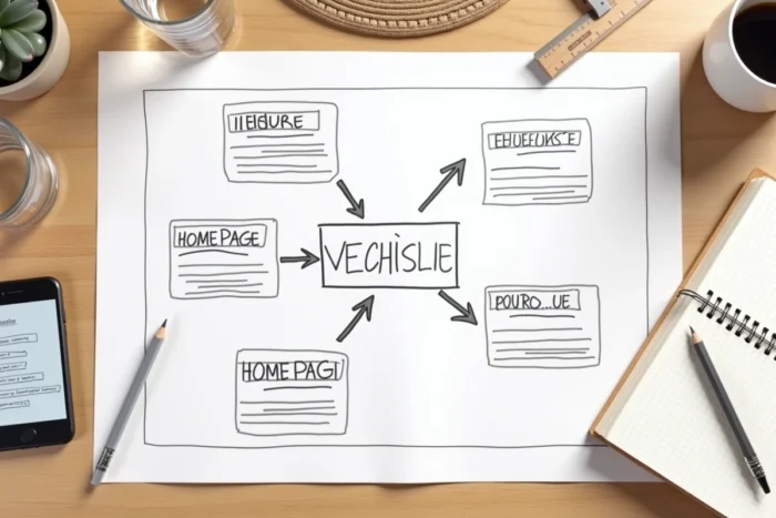
Measuring actual user paths before finalizing the website structure
Building a structure based on internal assumptions is the dominant pattern. Card sorting, often recommended during the design phase, provides a snapshot of user expectations at a given moment. However, it does not reflect actual paths once the site is live.
Navigation data, accessible via web analytics tools, reveal often unexpected patterns: pages assumed to be secondary that concentrate incoming traffic, main categories systematically bypassed by visitors who prefer internal search. An effective structure is continuously adjusted based on this data, not just during major redesigns.
The HTML sitemap deserves the same attention. Rather than generating it automatically and forgetting about it, maintaining it as an updated editorial index allows for spotting structural inconsistencies and ensuring that every important page remains accessible, both for users and indexing bots.